UK Promotional Poster
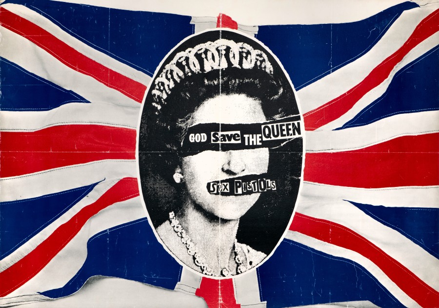
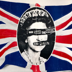
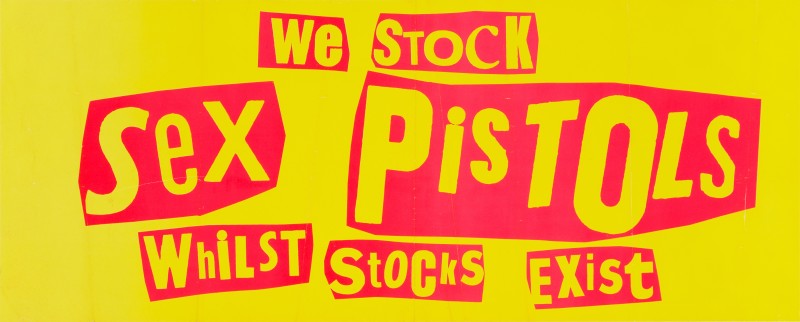
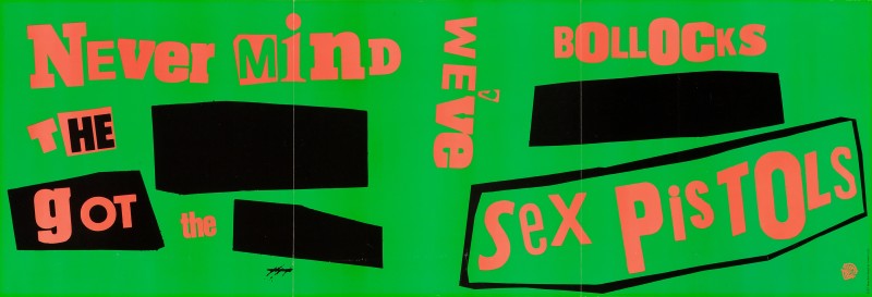
A rare and iconic promotional poster printed by Virgin Records to promote the Sex Pistols 1977 single God Save The Queen in UK record stores. Released to coincide with Queen Elizabeth II's silver jubilee, the alternative national anthem was regarded as an attack on the establishment and the monarchy, equating the Queen with a fascist regime. Highly controversial at the time, both the BBC and the Independent Broadcasting Authority refused to play the song.
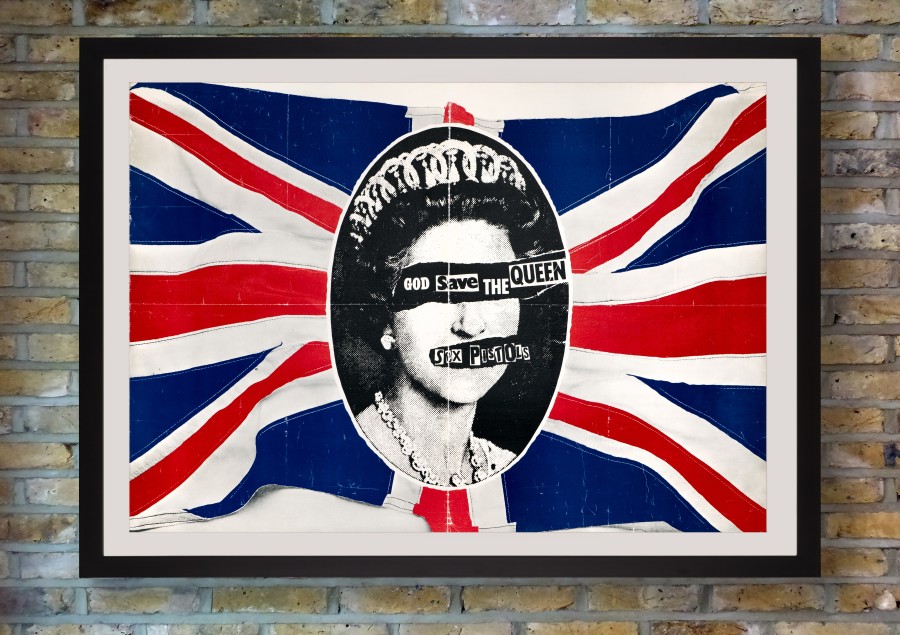
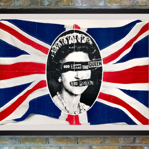
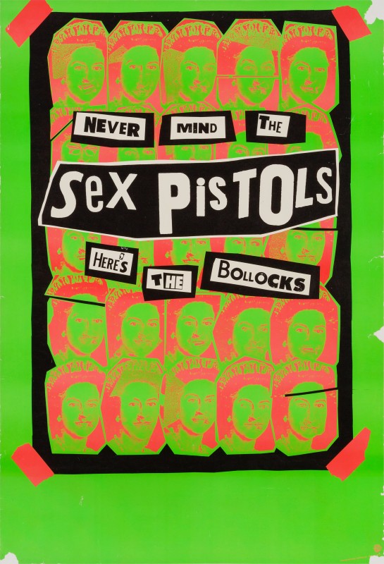
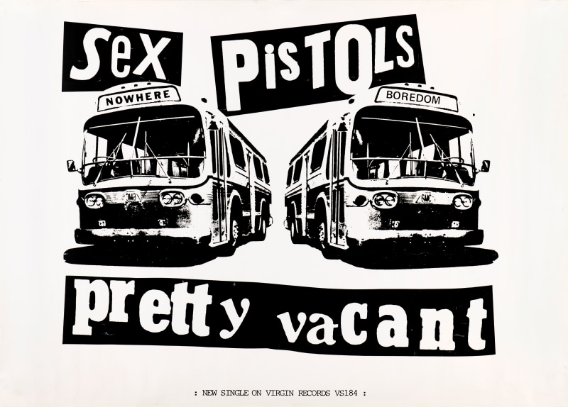
British artist Jamie Reid has become synonymous with the Sex Pistols and pretty much defined the image of Punk in the UK. His cut-and-paste aesthetic, featuring letters seemingly cut from newspaper headlines in the style of a ransom note, developed from his interest in radical politics. The famously defaced image of Queen Elizabeth II, appropriated from a photographic portrait by Cecil Beaton, was designed by Jamie Reid for the cover of the single - the Queen's eyes and mouth torn to reveal the song title and band name in signature ransom lettering. Voted the best record sleeve ever by Q magazine, the same design was printed in black and white over the red, white and blue of the British Union Jack flag for the promotional poster, issued to advertise the single in UK record stores in 1977.
Whether thrown away by the record stores after use or taped up in squats, few posters have survived. This particular copy was acquired from a former manager of a Virgin Records store in Bristol, who has provided a letter of provenance to accompany the poster. Rescued from store display in used condition, this poster has been conservation backed on linen with no restoration whatsoever, so that it now displays in authentically 'punk' condition. Many bootlegs and reproductions of this iconic poster are in circulation - provenance is paramount and mint original copies are extremely rare to non-existent.
An example of this poster is held in the collections of the V&A Museum, London, and the Museum of Modern Art, New York.
Condition
Conservation backed on linen with no restoration. Prior to backing the poster had one horizontal and one vertical manual fold plus two further partial vertical folds, general edge wear consistent with age and use, a few tiny edge tears and creasing throughout, with some surface colour loss to folds and creases. Backing has smoothed the folds, creases and edge wear. Darkening to edges. Colours bold and strong.
